When I was writing Blueberries, I made my own working cover. I scanned an image from an old art book of a naked Greco-Roman athlete statue and I cropped him at his waist. What was left of him were his ripped legs, butt, and a small, dangling penis. It’s an old, grainy image which I think looks very moody. It’s artsy-fartsy and masculine, blustering and silly—qualities I tend towards in my writing. It also takes a classical object as a point of desire, which is a form of conservatism I long to wash my brain of, but can’t quite. Look at its butt, though, and the image is stripped of reverence.
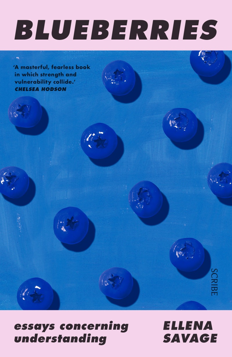
I had no intention of suggesting my Roman derriere as my real book cover. I knew that Bluebs, like any book by a young-ish woman about ideas not stripped of their lived consequences, which included some violence, would probably only, or mostly, be read by women and queer people, and so the cover would aesthetically suggest those readers. I also knew that a title like Blueberries would mandate a lush colour scheme, which my butt lacked. Both Text and Scribe make indisputably gorgeous covers, so I felt in safe hands. My only hope was that I would not get a Sally Rooney cover or one of those floral wallpaper covers with white text which individually look okay but are going to age horribly due to ubiquity. I think a good cover is original, striking, and mysterious. My Text cover, by Jessica Horrocks, is all three. It’s like an invitation to the abyss. My Scribe UK cover is—I wouldn’t say mysterious, but is striking and original, and I adore its rich colours.